Background
2020
Cloud Security is a new entrant in the market. Designed by Engineers and PMs, the focus is on features and velocity.
With scale of the product, usability issues grew significantly. Poor user experience became one of the top reasons for loss to competitors.
2021
I developed the design strategy with VP of Product and the UX team, demo'd a design vision and got buy-in from leadership to implement those design improvements in phases.
2023
Cloud Security gets ranked #3 in the market (in just 3 years) by analysts.
Revenue tripled in 2023
Progress on implementing the UX vision continues on.
Design strategy
Convergence
Single app experience. No product silos
Consistency
Same design pattern for the similar job to be done
Efficiency
Quicker analysis and resolution
Transformation driven by strategy
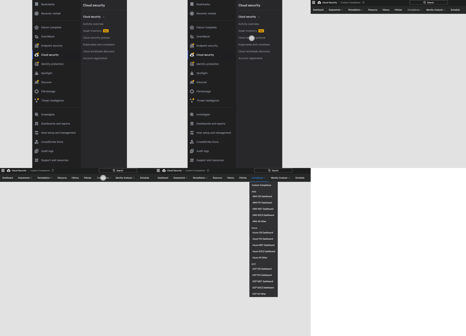
Menu Architecture
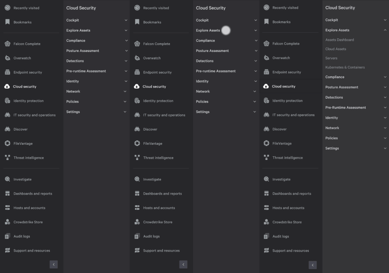
New menu architecture is aligned with personas and jobs, resulting in a simpler experience. Total page count is also reduced by 30%

BEFORE
Product silo'd
Not intuitive
Overwhelming

AFTER
Persona and Job-driven
Efficient
Effective details template
New details template presents relevant information about an asset or event in one page with progressive disclosure. It offers better situational awareness, quicker actions and a consistent experience across the products.

BEFORE

AFTER
Long scrolls
Overwhelming
Different formats
Situational awareness
Efficient
Consistent
Centralized onboarding with recommendations
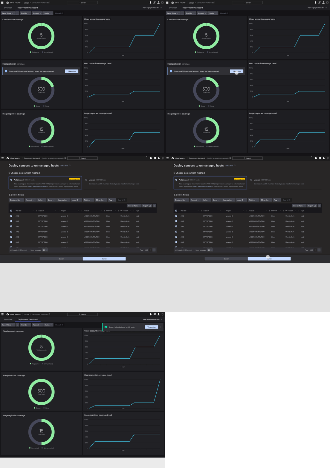
New Deployment dashboard is a central location to register different types of assets, it proactively discovers various unregistered assets and offers a consistent workflow to take action. This was my idea and is a differentiator for the product.
Improved account onboarding workflow reduced time to completion from 35 mins to 5 mins!

Account onboarding

Hosts onboarding

Image onboarding
BEFORE

AFTER
Disjointed onboarding
No call to action
Centralized
Discover features
Recommendations
New graph visualization for asset relationships and risk
New graph visualization clearly represents the relationships and hierarchy of an asset, with layers to show/hide relevant data such as vulnerabilities and user activity.
This representation, significantly improved situational awareness and risk analysis at large scale.


Quicker risk analysis
De-cluttered experience
Improved dashboards
1. Reorganized and consolidated dashboards to align with persona and jobs (same as nav architecture)
2. User research led the determination of widgets and designers worked with the design system team to create better widgets.
New dashboards became a key part of sales demos

BEFORE
Long scroll
Ineffective

AFTER
Actionable insights
Consistent pattern

