

Enhanced the user experience through a quicker on-boarding, intuitive UI design and clean visual design. This resulted in increase in the app's adoption and improvement in app store rating to 4 stars. (previously 2 stars).
Team lead and Principal UX Designer

Mobile App Redesign
Background
RSA SecurID Authenticate mobile app is a part of RSA SecurID solution for enterprises to authenticate users before granting access to work resources.
In 2015, it was used by over 1 million users, however the app had a low rating (2.5 stars) on both iOS and Android app stores. Also the adoption of the app among employees in the platform's enterprise customer was quite low.
From a strategy perspective this app was essential to make the RSA SecurID product sticky by getting majority of the employees to use it. Right now it seemed that poor usability was impacting that strategy.
Deep Dive
We conducted a heuristic review of the app, reviewed metrics, combed through comments on the app store and conducted user testing of the existing app.
The analysis of the results revealed :
On-boarding workflow was too long (10 steps), users were not comfortable providing certain inputs and after landing into the app it wasn't clear what they needed to do.
App looked old and dull
For most tasks the UI wasn't intuitive resulting in a high learning curve.

Design Process
User Persona
John is a sales rep, he primarily relies on Salesforce, Google drive and Zoom to get work done and win clients. Its essential for him that he should be able to reliably and quickly access these apps from any location and device.
All employees have similar needs as they use applications to achieve their goals. They are concerned about their productivity and feel security requirements can be cumbersome

3 Prong Approach
Per research, there were three key areas of the app to focus on. I and two other team members worked in tight collaboration to ensure the overall app design was cohesive.
ON-BOARDING
Existing workflow sought several inputs from the user as it aimed to configure all of the features that the app supported.
I saw this as the crux of the problem and designed a much shorter process using the following approach:
Set defaults, prompt for elective options later
Automate, instead of asking user for input
Consolidate input fields

VISUAL DESIGN
Existing app's visual design used shades of dark grey in the UI and graphics, resulting in users commenting that it looked dull.
We created a new color palette was created in alignment with company brand colors and improved the graphics to provide context without being heavy.

UI DESIGN
We usability tested the existing app, which uncovered these key issues
Design didn't match the mental model of the user as a result information wasn't in the location that user expected.
There was a lot of text and not enough visual cues, as a result user wouldn't be able to focus to execute quickly.
A lot of creative solutions, iterations and usability testing later we defined the new design.


Design Principles

Efficient
Simple
Modern
Final Design
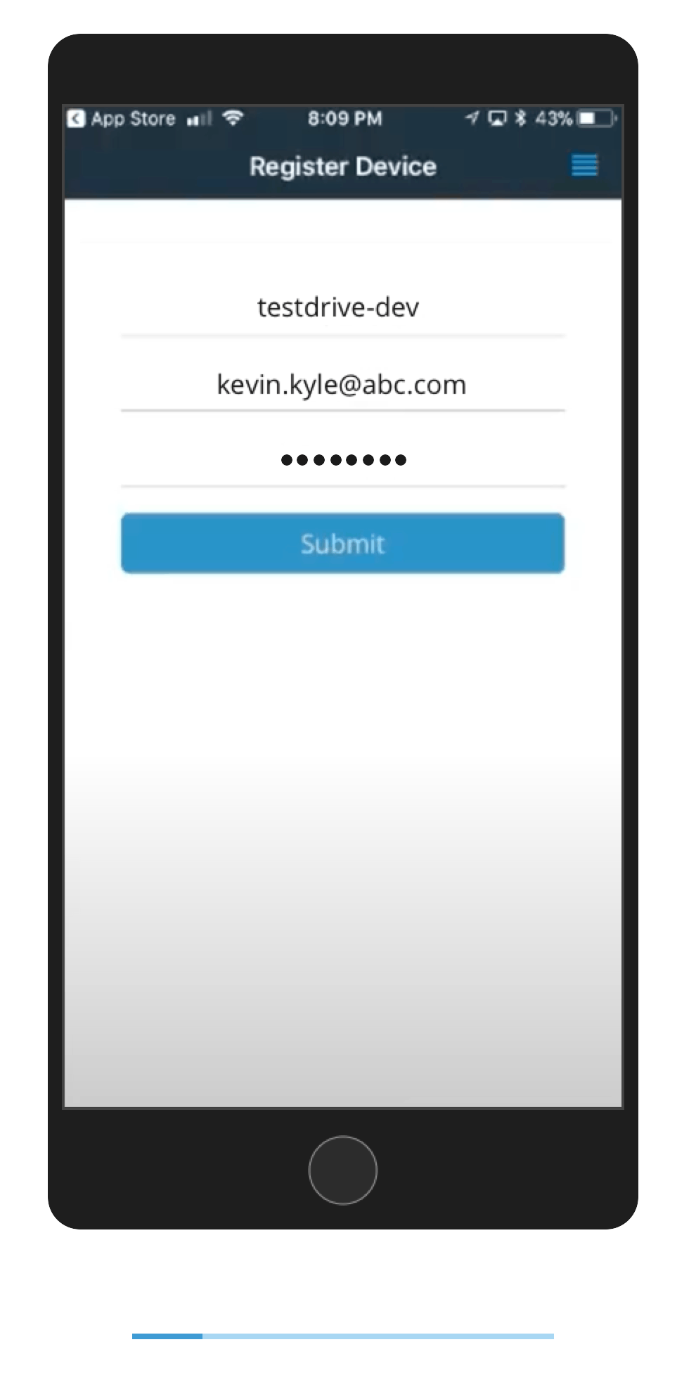
On-Boarding
New on-boarding workflow is much quicker, with number of steps reduced from 9 steps to 4 steps.
In usability testing all the participants were able to easily complete the on-boarding.
Visual Design
New visual design is bright, minimal and attractive.
It enables an efficient user experience and creates a good brand impression.


AFTER
BEFORE
UI Design

Simple, de-cluttered design, that draws focus on key elements.
Feedback
Love the Approve feature, its so quick and easy to use. The app looks great. Also they fixed the home screen!
- niloc89
Excellent application for multi factor authentication.. Elegant and simple to use. .. Kudos to team
- B Pruthi
The setup is a breeze. It took may be 30 seconds.
- Usability test participant
This update has been great. We don't get quarter as many calls as we used to about setting up the app.
- Customer
Post Release
The improved design along with a marketing campaign saw significant rise in the number of app users.
App store ratings for both iOS and Android versions climbed up to 4 stars. Previously it was 2 and 2.5 respectively.
The success of the app was an accomplishment for the entire team, as we all pushed the constraints of pre-existing process, design and UI components to bring this update to fuition.